Successful movie posters impact us at the most subconscious level—they grab our neurons by the throat and tell them, “Cancel your plans, leave work early, say goodbye to your family—you need to drop everything and watch this.” Ironically, as public as movie posters are, the world of movie poster designers is largely hidden from public view.
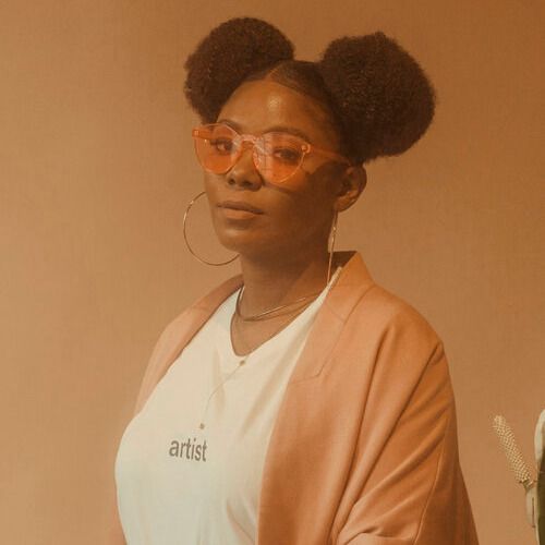
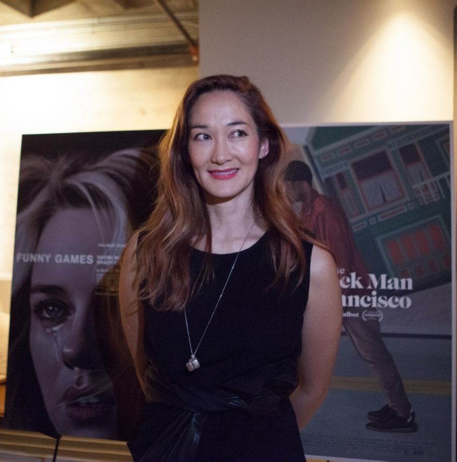
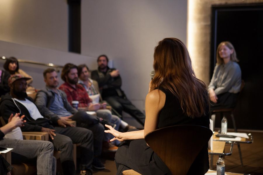
On Monday, December 2nd, FTW hosted an event with Akiko to discuss the process of designing movie posters and to announce the launch of her new book. Akiko Stehrenberger is the “poster child” for smart, eye-catching movie posters. She was actually recognized as a “Poster Girl” by Interview magazine in 2011. And rightfully so. While working 15 years in the industry, Akiko has won 15 CLIO awards and gained an impressive client roster that includes: A24, Neon, Sony Pictures, Saatchi & Saatchi NY, and so much more (we would list them out for you, but that would take up the whole article).
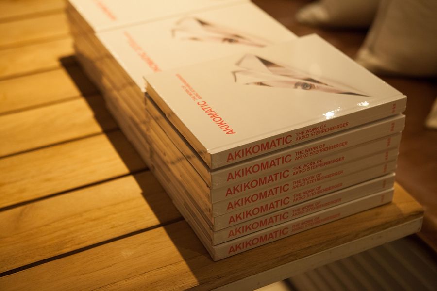
Akikomatic: The Art of Akiko Stehrenberger is published by Hat & Beard Press. After you order your book, keep scrolling for Akiko’s commentary on her favorite poster designs and the lessons she learned along the way.

"From an outsider's view, when you see a poster you're like, 'Oh, how hard can it be to make a movie poster?' Or like, 'Oh, this movie poster looks like shit, I can get to my sleep.' And I'm like, 'Just you try.'"
HOW IT ALL BEGAN
Akiko Stehrenberger: I went to Art Center College of Design and studied illustration. When I graduated, I moved to New York and didn't know anybody, didn't know where to start. So I went to a Barnes and Noble. I found all the magazines I was interested in and opened the front cover and looked for who the art director was and then just cold called them. Eventually I got hired [to design] for hip hop magazines.
[A few years later], a friend of mine was working at this movie poster advertising [company, Crew Creative]. She told me that they needed a receptionist and so I interviewed with one of the owners, Charles Reimers. [At the time], I just happened to have an illustration in Spin Magazine. In my interview I showed it to him, and he was like, ‘What are you doing? You're not going to answer phones. Maybe you can try being a junior designer.’Funny Games (2007) directed by Michael Haneke
For this project, the director really, really wanted this specific scene referenced and used in the poster. All I had was maybe a one inch by one inch DVD screen capture. The best way to explain that is you're trying to make a dress out of a one inch square fabric. It's impossible but I had to make it work.
It was such a huge turning point in my career because it was one of my first illustrated posters. At that time, illustration wasn't really [popular]. [The industry preferred] photoshopped heads in the sky. And so to push illustration was difficult. This definitely helped launch that, and slowly after, clients became more open to illustration.
At this time, there was a guy [Adrian Curry] who was very into movie posters, and he found it and he wrote all these articles on it. The next thing I knew, he called it the best movie poster of the decade.


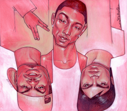
Where the Wild Things Are (2009) directed by Spike Jonze
I don't even think Spike got to see [this design]. I was a freelancer, so I was brought onto this project after they had already been working on it for half a year.
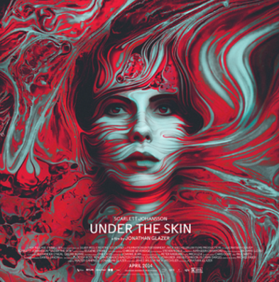
[I wanted to] make something that didn't exist. So I tried to simplify the idea of just a boy and Carol and him wanting to be one of them. A little kid who wants to be a grown up stands on his tippy toes. So in doing that, I had to construct this [digitally] from many pieces. [I grabbed] Carol's body from another photo. Then painted shadows on the feet. And I knew for Max, I really wanted to exaggerate the arch in his back. Obviously I didn't have shots of him on his tippy toes, so I had to cut and paste that, too. That's where illustration comes into play because you're literally painting rim lighting on them and painting to try to make it feel like one scene. So if someone ever thinks I crop a shot, I'm actually honored. But it's very rare that it's just a crop shot.Under the Skin (2013) directed by Jonathan Glazer
The first thing [the director, Jonathan Glazer] told me was that he didn't want a poster of galaxy stars and Scarlett Johansson's face. He was the only person I was talking to this whole project. I wasn't even speaking with A24.
I would think it was four months of just trying to figure this out. And then we finally got it [designed] and then didn't hear anything. At the end of the day [our poster] got killed. The actual poster is Scarlett Johansson against stars. A lot of people think the directors have last say, but the marketers do.

Nocturnal Animals (2016) directed by Tom Ford
We had some special photoshoot, but we only had it of Jake, so I had to try to find an image of Amy that would feel similar to his pose and she wasn't looking at camera. I literally had to paint her eyes to look like they're looking at us and try to make the photo be up to the quality as Jake. So in addition to illustration, we're doing so much retouching and a lot of wizardry that nobody knows about.
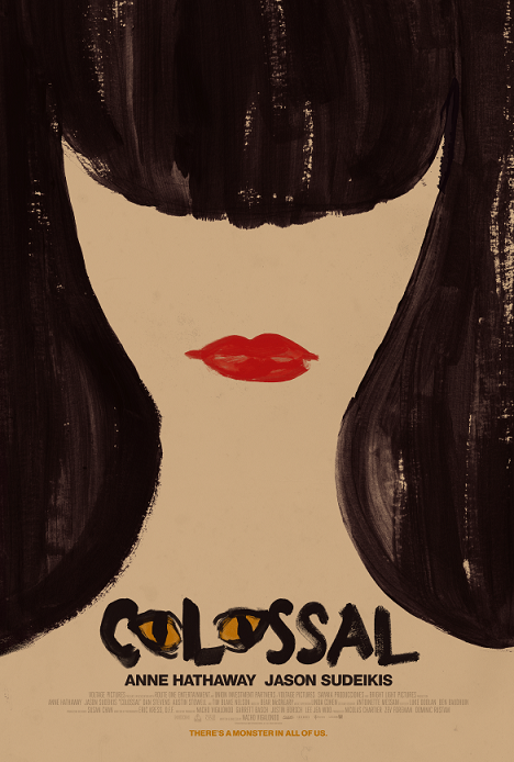
Colossal (2016) directed by Nacho Vigalondo
This was the first time I worked with Neon. The main actress has long hair and bangs, and in the story, her alter ego is a monster, which actually is the shape of the negative space of her hair. So their lips line up.
It's obviously a reward for people that have seen the film. I like throwing in little optical illusions whenever possible. And I love when I make something that people revisit, so I was really excited about this idea. When I presented to Neon, they were so excited and I was just so happy that they didn't try to add more to it or try to overcomplicate it. It was a big, big triumph for me to push something through so simple.
This was [made with] acrylic and Encore. I play with acrylic a lot. Usually, the deadlines are very crazy, so I have learned how to do things digitally and edit digitally. But whenever I am given a chance to do something on board, I'll try to do it.
I was so excited Neon went with it and printed so fast. I had to double check because I couldn't believe it. Actually, Mondo, which is a company that's known for making silkscreens, decided to collaborate with me and actually did a limited run of silkscreens of this poster. So that was fun.
"Pretty early on you get used to your stuff being thrown in the trash and you have to make so many posters all the time. You build thick skin and you just start changing your mindset to, 'Oh, I'm creating this for me.'"
The Last Black Man in San Francisco (2019) directed by Joe Talbot
I worked directly with A24, but mostly with [the director, Joe Talbot]. I was stuck in between both of them. At one point I had to play like a couples counselor because they got really heated. But the good thing is that [Joe and I] were on the same side. We were trying to push for a more simple poster.
This is my version of doing what the client wanted. I was like, "Why are we putting two people, it says last Black man." But they were obsessed with this shot. I tried to convince them over and over again and finally we were able to talk them into doing one for me and one for them. So this one with all the cast was for them. I tried not to make it a clusterfuck with all the people. Luckily I was able to kind of blend them into his shirt as my way of trying to appease them. This is the one that was in theaters.
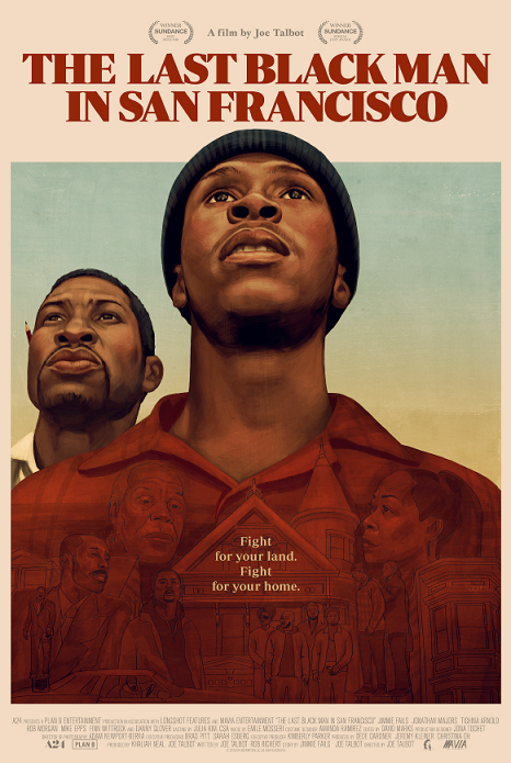
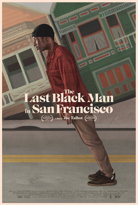
The second one was used for online [campaigns] and for invitations. This was the one I was fighting so hard for. I was doing everything in my power not to use Golden Gate Bridge, so I kept thinking about San Francisco and it finally came to me like: those ridiculously steep streets.
I came up with this idea that I thought touched on so many themes of the film. There are a lot of surreal moments in the film and to be corny, it's showing his metaphoric and literal uphill battle. And I was really waiting for a project that I could reference the painter, Barkley Hendricks, so this seemed perfect for it.
I'm definitely about less is more, so if there's any way to have a simple idea that's still intriguing, I'll try to fight for any time I can. I'll definitely pick my battles, but this movie I fell in love with. One of my first ideas was this and I just had to trust my instincts to push this.
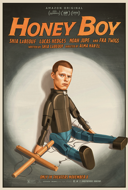
Honey Boy (2019) directed by Alma Har'el
This was working straight with Amazon, and then towards the end I was working straight with Alma through email.
When there are multiple posters and they each have a different character, they're called banners. There were already two beautiful banners for the son [and the father character], and Amazon contacted me about another poster for Lucas. Through the concepts, we landed on this. It went pretty quickly just because they had hired me so late in the game.
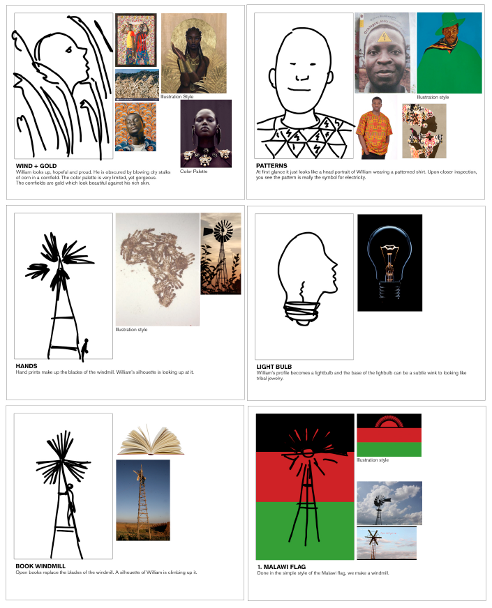
The Boy Who Harnessed the Wind (2019) directed by Chiwetel Ejiofor
I threw some ideas towards the creative director, and, as you can see, it looks like I drew them with my foot. But the idea is to just show the idea and the rough composition. I usually attach a graph to show the illustration style.
One of my favorite ideas was the top left, which actually became the poster, but it started off by just randomly seeing that gold and brown illustration in the corner. From that, I came up with the idea of the corn stocks, which is important in the movie. It's based on a true story. It's about a boy who brings electricity to his town in Malawi, and he does it by building a windmill that generates energy. I thought it would be a good thing to play with the idea of wind and I thought it would be a good vessel in showcasing that without being too literal.


Portrait of a Lady on Fire (2019) directed by Céline Sciamma
The final poster one of my first ideas. I wanted something simple and iconic. Again, I love optical illusions, so anytime I can throw them in, I will. So I came up with this concept of the two women kissing, which is in the negative space. I originally did it with acrylic, but I didn't feel like it gave it enough punch. So I helped make it feel more dimensional with the computer.
Again, this was for Neon, the people that I did Colossal for. So I was really excited that this was the second project where I could do something super simple and have an optical illusion within it.
Lessons from Akiko:
1. Designers aren't notified if their work is a "finish" (an official poster for marketing campaigns). But according to Akiko, being published shouldn't be your sole goal.
Akiko Stehrenberger: The IMDb for posters is IMP Awards and that stands for Internet Movie Poster Awards. As [film posters] are released, they are posted. That's when I know [I can talk about a finish].
Certain people really focus on finishes and I think when you get caught up in that, that's a whole different ball game. It's very easy to get burnt out. Between coming up with ideas and dealing with crazy clients, it's hard to manage it all. I feel like I’d never see my friends.
But I think if you want to make better work and don't care about that, then it changes things. [Beginner designers] tend to count the finishes, because that kind of validates them. But once you've been doing it for so long you're like, “I don't give a shit. I just want something that's not horrendous to come out.”
2. Multiple designers in the same studio can actually compete for the same projects.
I share a studio. A lot of the times, [multiple designers are] on the same project, competing against each other. We don't even know. We never really set foot in each other's office because we just have our head down working like total idiots. So there had been like three projects where a friend came in, asked me if I had snacks and was like, "Wait a minute, I'm working on that." It's funny when it happens. That friend actually did one of the other posters for Colossal. I think Neon did three or four posters for the movie.
3. Often, studios don't give designers much to work with. Photoshop and illustration skills are your best friends.
Good photography is more and more rare for each project. I think films run out of time and budget. So the upside to that is that they're more open to illustration.
Every project is different. Sometimes there's assets, sometimes there's absolutely nothing. And so you really have to use your skills to make something out of nothing.
4. There are pros and cons to working directly with a studio and communicating through an agency.
A lot of people like working straight with the studio because there's less middlemen. But when that happens, those projects ended up lasting forever. So I kind of like when an agency hires me for a week because my ideas are fresher and I just work quicker. I send them off and hope they go somewhere. Sometimes they do, sometimes they don't.
I do a dance between the two. If I do too many straight-to-studio [projects] back to back, it gets a little draining, so I like breaking it up.