The Grade is the lens through which a viewer engages with a film—it tells a story all of its own. If one could see the footage as it was shot, the average filmgoer would be shocked at how different it looks before going through this process. Without it, a Paul Thomas Anderson film could easily look like a home movie.
What used to be a mysterious, behind-the-curtain artform, Color Grading is now a well-known part of the filmmaking process– and for good reason, it is the final step to the life of your project that can completely transform the film. Traditionally a photochemical process limited in capabilities, now many well-known colorists have become household names among filmmakers and the software they yield such as DaVinci Resolve and Baselight are commonly known for their immense power to manipulate the moving image.
Ayumi Ashley is the lead colorist at Ntropic and is based in New York. Below, she gives an intro to her process and walks us through the steps that help us successfully collaborate with a colorist.

What Is Color Grading?
Color is one of the final steps in the lifespan of a project. It happens after “picture lock,” the stage after which there will be no more changes made to the edit.
Color grading can be thought of as a two-part process. The first part of it is often called “color correction,” and originates from the tradition of the process being a photo-chemical one. At this basic level, a grade’s priority is to remove unwanted distractions. If the white balance is off or the talent’s skin is feeling too red, the audience would be taken out of the story. The audience expects a certain range of hues for things like skies, foliage, food, and skin tone. Colorists can ensure that colors are represented on-screen in a way that is consistent with these expectations. Mixed color temperatures can be smoothed out, highlights controlled, and exposure changes made even.
Ideally, those are just the basics and you take your grade into a creative realm. Colorists bring style, mood, and story to your film. This realm is often referred to as “Color grading,” though those terms are loosely assigned. This is the slightly less quantifiable “mood and emotion,” texture, modern/nostalgic, “shape” of the light, the curve with which the contrast is distributed, color tinting in the shadows, highlights or overall image, and any other creative decisions that go a step beyond correction. Color grading can change reality by creating a nostalgic vintage look, a scary dark forest, an oppressively fluorescent office, or a futuristic lab. The most visually memorable films have a look that can range from subtle to extreme. If done with intention and consistency, color can completely immerse the audience in the world of your story. And for better or for worse, if it’s a commercial project, the project is going to need to be aesthetically pleasing to the client and consistent with the brand.
"The possibilities of coloring are virtually endless so good communication helps . . . "
Describing Your Vision
It helps colorists and speeds things up when you can communicate your ideas and opinions. The possibilities of coloring are virtually endless so good communication helps to strengthen your relationship with your colorist and shape the final product to your taste.
Things that can be helpful when describing a vision:
-
Any vision boards or pre-pro decks for cinematography
-
Reference stills or videos from other films or photoshoots
-
Brand guides and product reference images
-
Verbal description of looks or any story points that influence color
-
Anything you can share about you or your clients’ general color preferences
-
Any specific requests or concerns
This is just the starting point of a conversation, and sometimes fewer images are better than more. While PDF compilations of stills are nice, a simple folder of stills can be even better. With the latter, the colorist can pull up the images individually so you can view them on the color correction monitor together during your discussion.
Examples of Results
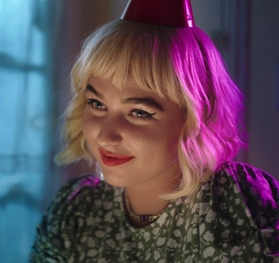
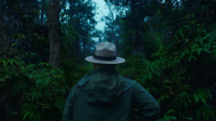
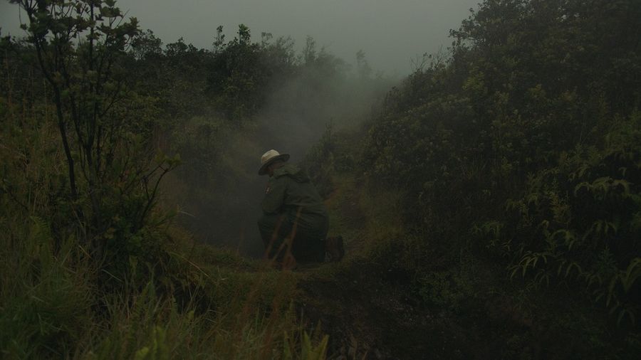
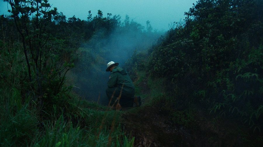
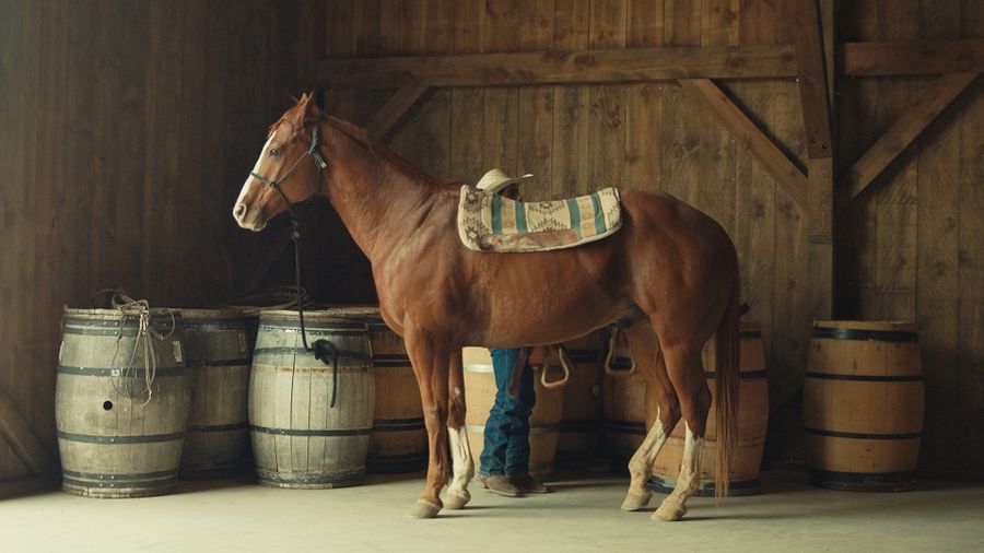
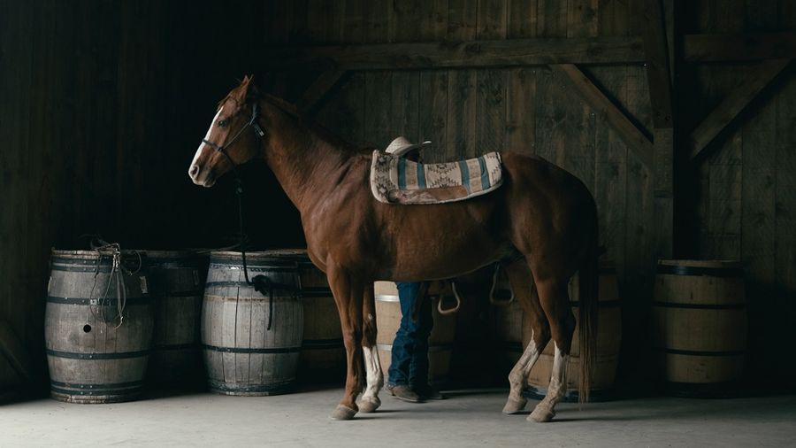
The images below are reference images that I received from a client. They show a desired level of contrast, the hue for foliage and skintone, and prominent teal/blues.
I based the color grade of the client's film on the references provided. Here are the results (see captions in the slider below for descriptions):
(Film: KAHOLOʻAʻĀ / Courtesy of Bradley Tangonan)
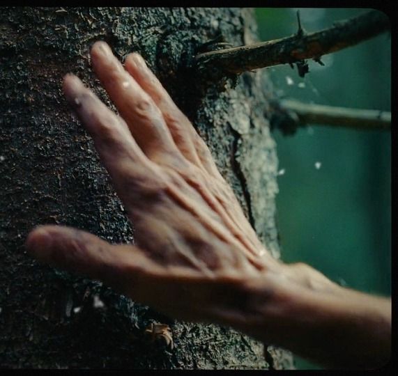
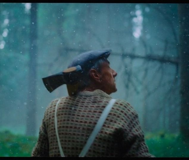
Here are examples of how client briefs lead to different results (see captions in the slider below for descriptions):
Providing the Right Files
Ideally, the color facility you are working with are the “guardian” and controller of workflow and data management. A well-run project should involve us as early as possible so we can plan efficiently, and early planning is always advisable. Once received, the color facility will need some time to ingest the project and rule out or solve any issues with the prep. It’s important to know when and how the facility wants to receive your materials so the editing team can be prepared. The color team can help you along the way with this—we prefer that you ask us all your “stupid” questions if it helps you bring us the best prep possible. You want to give your colorist the most high-res, unadulterated version of your footage (no color effects, no LUTS, etc.). This usually means the camera original files. You may have been editing with lower quality files to avoid large file sizes, perhaps there was a color effect or LUT baked in so the footage doesn’t look flat during editorials. Ditch these files and go back to the original source so your colorist has the most information and the highest quality image possible to work with. Sometimes it’s acceptable to convert files into something like a ProRes or DPX sequence.
Things can get really technical, so when in doubt, check with your facility. Ask them how they would like the specs baked in if you’re working with any RAW formats like .R3D. Each color facility will have a spec sheet on how they would like you to provide the materials. This will likely be a detailed list with a lot of requests or demands that are there for very good reasons- the handoff to color can either be a piece of cake or a total nightmare. So get this list and check it twice!
Be sure to reach out for this early on in your process if possible so your editor or assistant editor know what’s coming.
What Goes Down in a Color Session
We’d love to hang out with you and have you witness the moment your vision comes alive on-screen. However, whether or not your presence is needed for the entirety of the session depends on the project and your relationship with the colorist. It may be nice for the colorist to have some time to get started on their own. Other times, it may be preferred that you’re there at the start of the session to make sure no time is wasted on the wrong look. You may not go into the color session at all, and review uploaded stills and files remotely. Have a conversation; plan accordingly.
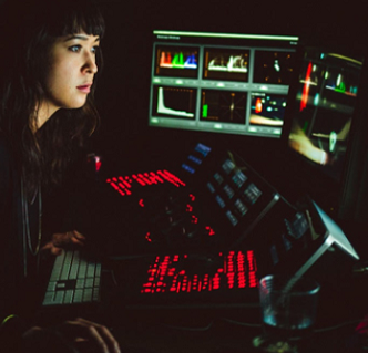
The color session happens in a dark, light-controlled room so we can judge color without bias. It can get a little straining on the eyes in this kind of environment. The colorist is used to this, and it’s okay if you are not. There’s no shame in taking breaks to refresh your eyes and stretch your legs. A proper color suite will have gentle 6500K lighting against a neutral mid-gray wall, so if you need to “calibrate” your eyes you can rest your eyes on this soft glow for a moment.
"However, whether or not your presence is needed for the entirety of the session depends on the project and your relationship with the colorist."
Be prepared for some downtime while the colorist is working. Listen to the colorist’s dope jams, have a chat, and relax. You’re in good hands, so enjoy the good vibes. Maybe bring some work with you. During the process, don’t be afraid to ask questions or express uncertainty.
Clients may also want to weigh in even though they’re not at the session themselves. We can provide stills or video postings for them to have a look. Let your colorist and color producer know and they can sort that out for you. It would be good to keep the client available via phone or email in order to get immediate feedback. This helps us use our time efficiently.
We’re here to collaborate with you and help guide you through the process.

"It’s the colorist’s job to hear all your flowery, poetic, or descriptive words and translate it into colors on-screen."
Communication in a Session
While a colorist has many technical tools and terms for their process, you don’t need to know what everything is called. It’s the colorist’s job to hear all your flowery, poetic, or descriptive words and translate it into colors on-screen. Everyone has their own language for colors and we’re not judging your choice of words. However, it doesn’t hurt to be equipped with some basic understanding of the tools and the craft.
A primary grade is a color effect that controls the entire frame. In the colorist’s mind, the image is divided into three regions: Shadows, midtones, and highlights. Within these parameters, we can adjust things like color cast, contrast, lightness, brightness, and saturation.
A secondary grade is a color effect that controls just a portion of the image. The region of the frame could be selected by a shape (circles, geometric shapes, or custom curves) or by selecting a region of hue/saturation/lightness (just selecting the skintones, the greens, etc.). You can even select and track objects that move throughout the frame.
People have all sorts of names for colors, and we like hearing the wild ones—but colorists are likely thinking in terms of the following colors: red, magenta, blue, cyan, green, yellow, and orange. All colors can be expressed by using one of those words, a combination, and their variations in brightness and saturation.
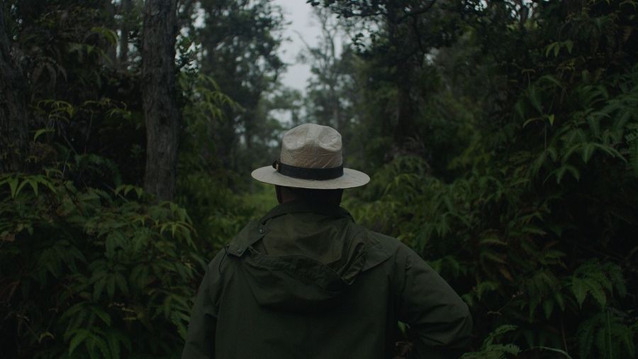
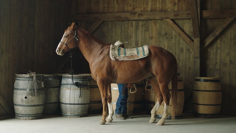
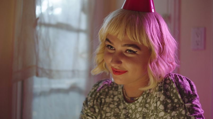
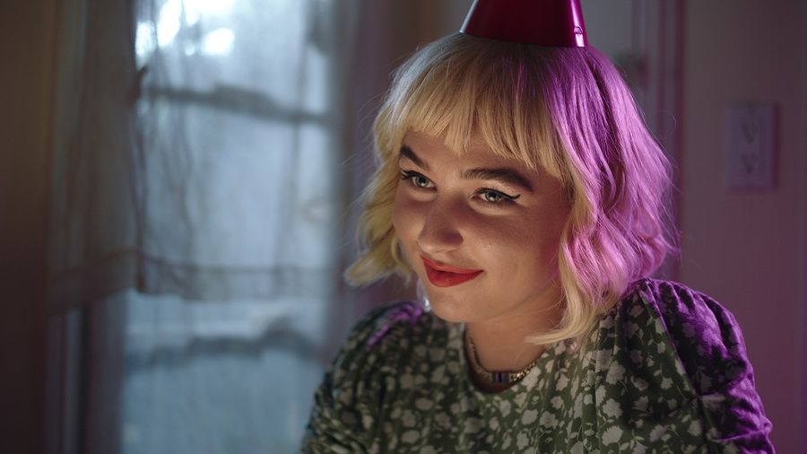
Below are examples from a music video I worked on that illustrate how primary and secondary grades are used together to achieve a certain look (see captions in the slider below for descriptions):
(Music video: Maty Noyes – New Friends / Courtesy of Ian Rowe)

Here is a recap of what should happen before your session so you can float through the coloring process like a pro.
WHAT TO DO WHEN YOU’RE EXPECTING A COLOR GRADE:
-
Communicate your vision with the colorist.
-
Ask the Color Facility for what file format they prefer to work with and ask for a spec sheet.
-
Provide the files sooner than later.
-
Determine if you will be personally present in the facility during the process.
-
Be prepared to provide feedback.
-
Clarify what to expect in terms of how long it will take for the facility to render, QC, and deliver the project.
After the Session
When everything else is finished, there is still conform and delivery. At this point, the color team has provided all assets based on the conform artist’s specs. You’ll still need to reassemble your project and marry the visuals to sound and graphics before making masters and compressed deliverables. Many colorists are attached to a facility that offers finishing services, so ask their producer if you’d like to make this a one-stop shop.
At the end of the day, the colorist is completing the process the cinematographer and production team started. It can be a great vibe by this point in the process because you have already fought your battles and are celebrating reaching the home stretch. There are a lot of right answers in the color grade so it should be a fun and positive collaborative environment with lots of great ideas flying around. This is when you are reminded that the image you’re used to looking at during editorial isn’t what your film is going to look like—your footage actually looks like a MOVIE and the great choices you and your DP made on set re-emerge and shine. So sit back in the relaxing lighting, listen to some tunes (the envy of editorial and sound mix!), have some of those famous post-facility snacks, and make your project look like the kick-ass project it’s meant to be.